Story
The U.S. Presidential Election of 2000 between George W. Bush and Al Gore was a nail-biter. It was, in fact, the closest presidential race in U.S. history, decided by a mere five electoral votes, and one-half of one percent of the popular vote. The key to victory was winning Florida, and the key to winning Florida came down to a recount in four counties, counties where there seem to be a high number of voting irregularities: missed votes, double votes, and an improbable number of votes for fringe candidates not popular in the region.
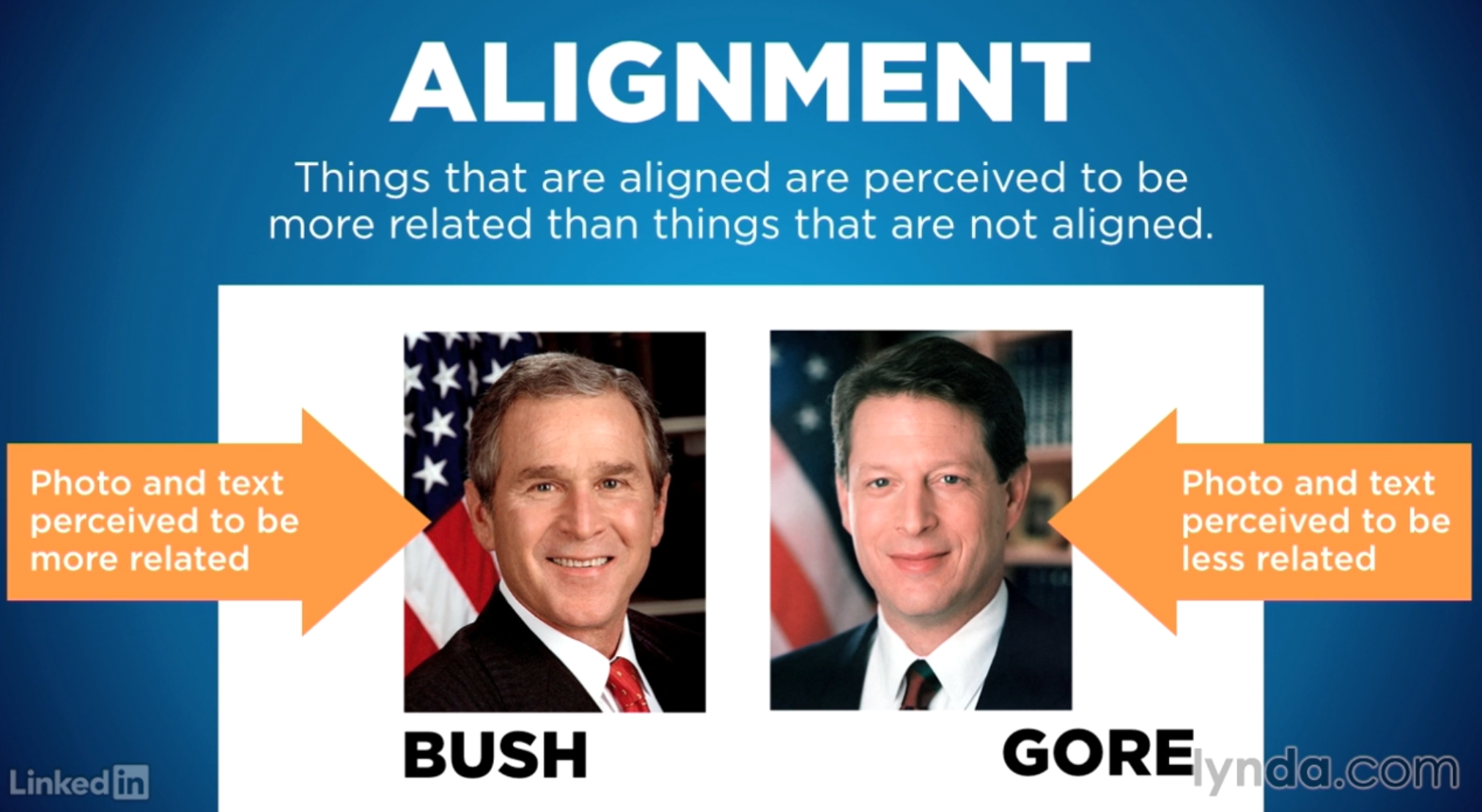
The cause of the problem? The ballot violated a fundamental principle of design, the principle of alignment, and the resulting errors decided the U.S. presidential election of 2000. The principle of alignment describes a fact about human perception: things that are aligned are perceived to be more related than things that are not aligned. Further, things that are aligned lead the eye, which then influences the sequence in which people process information. Western readers tend to read top-down, left-right, and so, elements that align with this reading pattern strongly influence perception and behavior.
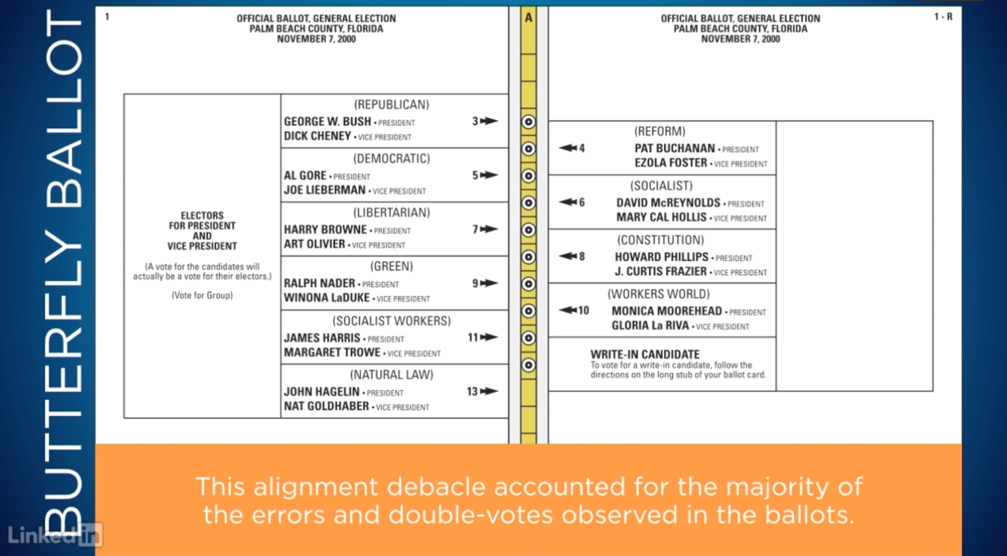
In the case of the ballots in the key Florida counties, a design known as the Butterfly Ballot was used. The ballot presented voters with two pages of candidates separated by a column of punch holes. Voters were to find their candidate, and then perforate the appropriate punch hole to cast their vote. So, voters read top-down on the first page, and saw Al Gore as the second choice in the list. Then, the separating line above Al Gore’s name led their eyes right to the second punch hole on the ballot, which led many Gore voters to punch that hole. Unfortunately, for Gore, that second punch hole represented Patrick Buchanan, the candidate on the opposing page. Many Gore voters, no doubt, punched the second hole, detected their error, and then, tried to correct it by punching the correct hole, not realizing this would invalidate their vote. This debacle accounted for the majority of errors in double-votes observed in the ballots. Researchers who analyzed the ballots, and corrected for these types of errors, found that if they had been avoided, Al Gore would have won the election. A ballot design with poorly aligned elements literally decided a U.S. presidential election.

Now, imagine you were the ballot designer. Could you have anticipated the problem? What would you have done differently? The key to making sure the voter’s intent is captured correctly, is making sure the candidate information leads the voter’s eye unambiguously to the correct punch hole. A simple tweak to the ballot design, presenting the candidates on the same page, and making the row lines clearly aligned with the punch holes, would have fixed the problem.
Takeaway
Elements in a design should be aligned with one or more other elements. This creates a sense of unity and cohesion, which contributes to the design’s overall aesthetic and perceived stability. Alignment can also be a powerful means of leading a person through a design. For example, the rows and columns of a grid or table make explicit the relatedness of elements sharing those rows and columns, and lead the eyes left-right and top-bottom accordingly. Edges of the design medium (e.g., edge of a page or screen) and the natural positions on the design medium (e.g., center lines) should also be considered alignment elements.
In paragraph text, left-aligned and right-aligned text blocks provide more powerful alignment cues than do center-aligned text blocks. The invisible column created by left-aligned and right-aligned text blocks presents a clear, visual cue against which other elements of the design can be aligned. Center-aligned text blocks, conversely, provide more visually ambiguous alignment cues, and can be difficult to connect with other elements. Justified text provides more alignment cues than unjustified text, and should be used in complex compositions with many elements.
Although alignment is generally defined in terms of rows and columns, more complex forms of alignment exist. In aligning elements along diagonals, for example, the relative angles between the invisible alignment paths should be 30 degrees or greater; separation of less than 30 degrees is too subtle and difficult to detect. In spiral or circular alignments, it may be necessary to augment or highlight the alignment paths so that the alignment is perceptible; otherwise the elements can appear disparate, and the design disordered. As with all such principles of this type, there are exceptions (e.g., the misalignment of elements to attract attention or create tension). However, these exceptions are rare, and alignment should be considered the general rule.
For most designs, align elements into rows and columns or along a centerline. When elements are not arranged in a row/column format, consider highlighting the alignment paths. Use left- or right-justified text to create the best alignment cues, and consider justified text for complex compositions.
Learn More
- LinkedIn Learning
- Page 24 of Universal Principles of Design